Tuesday, May 24, 2011

The Final Hurdle

For this Final Project of first year in LSAD, which just so happened to be an advertising campaign, I choose to promote Irish Inland Waterways (God knows why, I mean, I can't even swim...).

Here are my finished Billboard and T-shirt designs: Billboards


T-Shirts
(Swimming)

(Fishing)

(Sailing)

(Rowing)

And as for the freebie, my idea was tiny bottles of water with a label that states: Free Water, Love Me but Don't Drink Me! 

Saturday, May 14, 2011

New Brief: Positive Ireland

Positive Ireland.  Sounds easy, huh? Trust me, it's not.  For the first week or so I was having some serious trouble with this one.  It felt like I was jumping from idea to idea, but having no real concept behind any of it. 
What am I trying to promote? What is my message? - I had to keep asking myself these questions.  Before I could solve the problem, I had to understand it.

I did brainstorm after brainstorm (it's always good to get everything out of the head first..). Here are just a few:


Eventually I decided on promoting Ireland through its inland waterways...a little dull? Maybe.  But I'm pretty sure there's a way of making it interesting (and positive...and Irish...somehow :-D)

My message: Ireland has great inland waterways, use them!!!

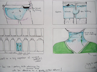
So, thumbnail time...
(Trying to be quirky with the imagery here, but I really don't think its working)
I think these thumbnails don't really work as billboards.  I need a Copyline here, something good and catchy.  Also I think I need to make it clear what I'm trying to promote. 

You can't bottle what we got

What can people do on the waterways?
(I'll focus on 4 main activities, maybe doing a series of billboards)
Fishing - Swimming - Rowing - Sailing

Tuesday, April 19, 2011

To dance, or not to dance?

I got a place in Graphics!!  I can't believe it.  I mean, I'm still smiling.  And to celebrate? Well, it's off to Galway for the weekend...


Who says an adult can't enjoy a perfectly good ice-cream?...


And a drink or two?...

Love you lots Aisling xox
(Yes, I know you're reading this. x)


U2  'Where The Streets Have No Name'


Tuesday, April 12, 2011

My Sculptural Book

My idea for our second brief, to design a sculptural representation of the book, was to make a metal box that when opened reveals a bright pink interior, and the number 42 hidden out of sight.

The metal shell is based on my feeling that this book consists of a variety of metal surfaces and goes from spaceship to spaceship.  Also, metal is cold - just like space.

The idea of the pink paper on the inside comes from an idea I had about the book.  It is quirky and random, but somewhere in there the humour is still rooted in reason and logic.  So I don't believe that the outside of the box would be bizarre, but the fact that you are greeted with a colour you wouldn't expect is very interesting.

42.  This is the answer to 'Life, the universe, and everything'.  It is only known by a giant super-computer and an ancient race of planet architects.  It is hidden away, and the mice believe in is hidden inside Arthur Dent's brain.  I want to get across that the answer is shrouded in mystery - if that is the answer, what is the question?

My first step was to mold the aluminium into the desired shape and hold it in place..


On the front of the metal sheet I marked out a rectangular-shaped door area so I could then cut it out and later replace it with lead.


 (yes, my dad is my technican.)


I left the back open to allow for an insert of pages.  I did this to convey that this metal sculpture is in fact a book and that it still contains information - but the reader/audience is unable to get to it.


Once the pages had been covered, I decided to add more metal pieces in the form of tin and lead.  These scraps of metal would then be held in place by bolts.  I wanted there to be a metallic feel to the sculpture.  This is to show that the majority of the story is set in a spaceship.  Although one of the ships is brand new, the others are very much out of date, and that's the look I was going for. 


I then began to cut out the paper so that there would only be a hollow left, straight down to the metal. 

Final Book Cover Design

Here is my finished cover design for The Hitchhiker's Guide To The Galaxy:


It took me a while to get the type exactly right, but I think it turned out very well.  The idea is simple, and just a little illogical.  But I think it gets the message across.  Travelling through space.

I had several variations of this cover, one of which I actually went outside and photographed the road to use, but soon the essence of the concept started to get away from me.  Often simplicity is best. 

Monday, March 28, 2011

Looking and SEEING

Taking a closer look at how books are arranged and displayed in bookshops, has really opened my eyes to the stark and frightening reality - there is a LOT of bad design out there.  And I mean bad.  Awful, in fact.
Designs where there is no real thought put towards developing a concept or the type that is used, or anything else of that nature.


There are no words.

Sunday, March 27, 2011

Background Research

My interpretation of the book 'The Hitchhiker's Guide to the Galaxy' (with regards to mood, tone, colour palettes, textures, and the general look of worlds)

Location/Setting

Space - Various Planetscapes incl. Earth and the ancient world of Magrathea (which has two suns)
Planet Earth - Somewhere near London

Ship Interiors
There are two spaceships that feature strongly in this story: 1) The Vogon carrier ship (which is rusted and dirtier, and has unwashed objects like mattresses, etc) and 2) The Heart Of Gold (this cleaner and whier, and brand new.  It has an oblong shaped control room.  It is so new, the plastic hasn't been taken off some of the seats yet).

The two ships each have very distinct and contrasting looks.

Here is a mood board for each of the ships interiors:


Colour Schemes


Saturday, March 26, 2011

My Prezi


So here's my presentation for research work (looking all fancy and what not.  Ah, the beauty of technology...).  This was the first time that I'd ever done a full-on big screen presentation - and I was nervous as hell.  I can only get better, right? Just as long as I don't forget get to speak.

Look a little closer...

When it comes down to it, this whole project isn't just about trying to be the best or trying to have the best design or whatever.  It's about learning.  Looking and seeing, and learning from other designers - and as we were told - from each other. 

Walk into a book shop and look around (you don't need to convince me, I could live in a book shop...of course, it wouldn't last very long.  You can't eat books.  I learnt that the hard way...).

How are the books arranged?, how are they displayed?, what kind of book covers grab you and pull you and make you look at them a little closer - basically, what makes a design good? Concepts, wit, typography, colour, brilliant photographs; there are lots of reasons for something to really work.  Here are some designs that have caught my eye over the past week...


This book is called 'The Next Page'


(I think I'm in love with this...)